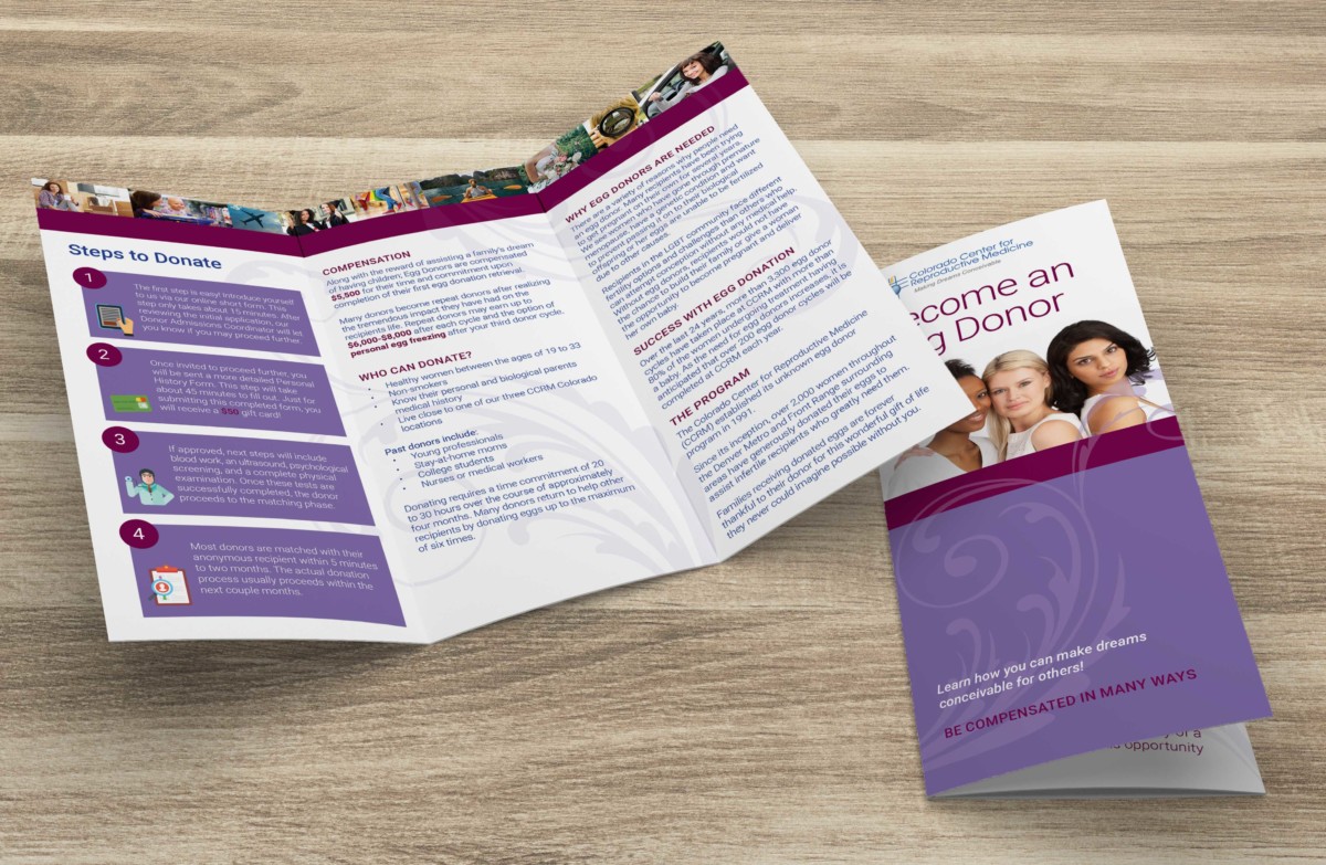
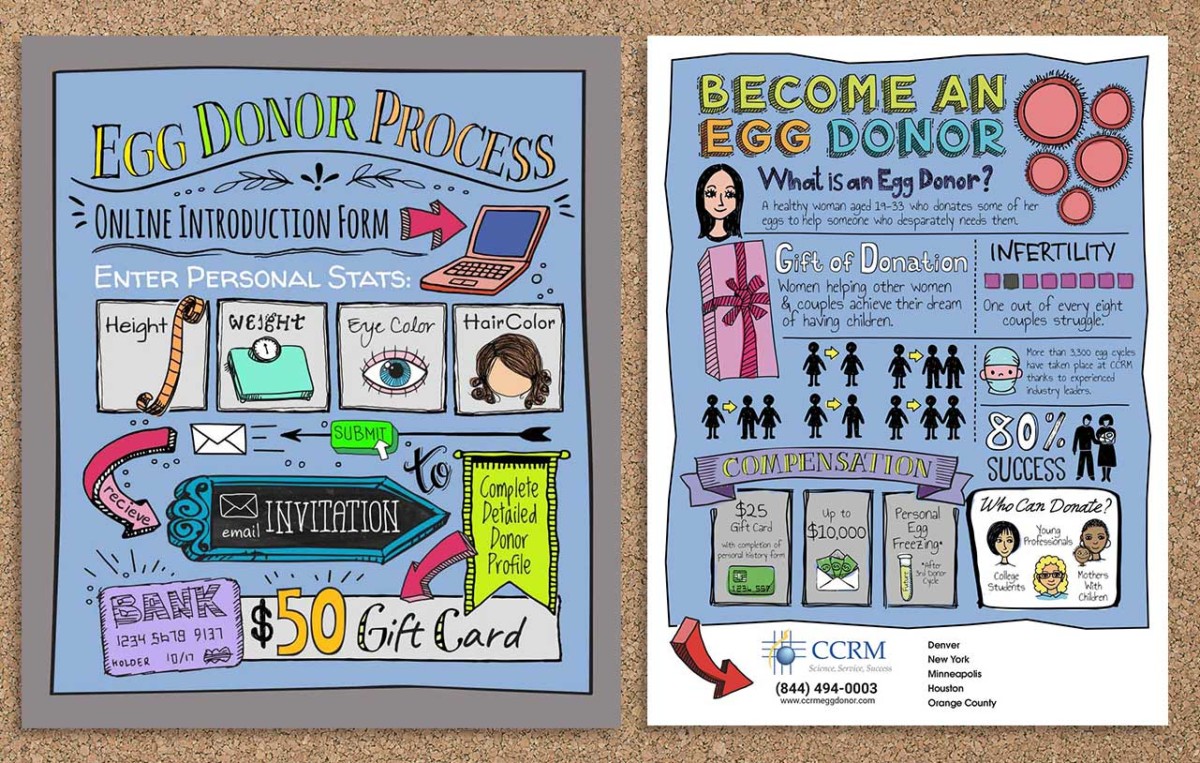
I designed an informational brochure for potential egg donors. The goal was to communicate the steps required and the amount of compensation in a tasteful way.
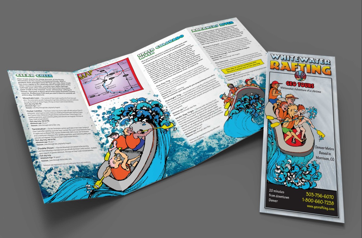
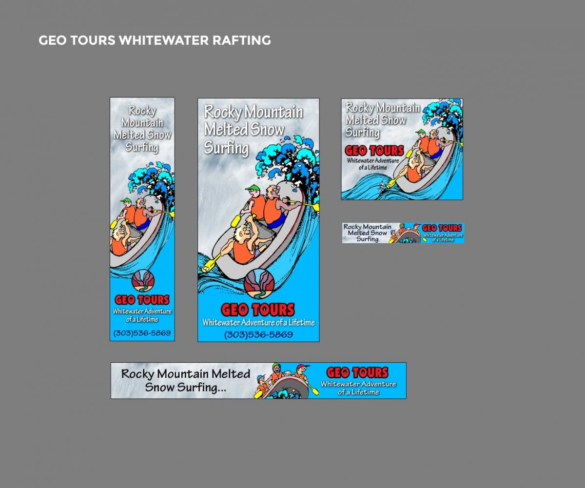
The Geo Tours rack brochure uses the cartoons they have established as a part of their look and feel.
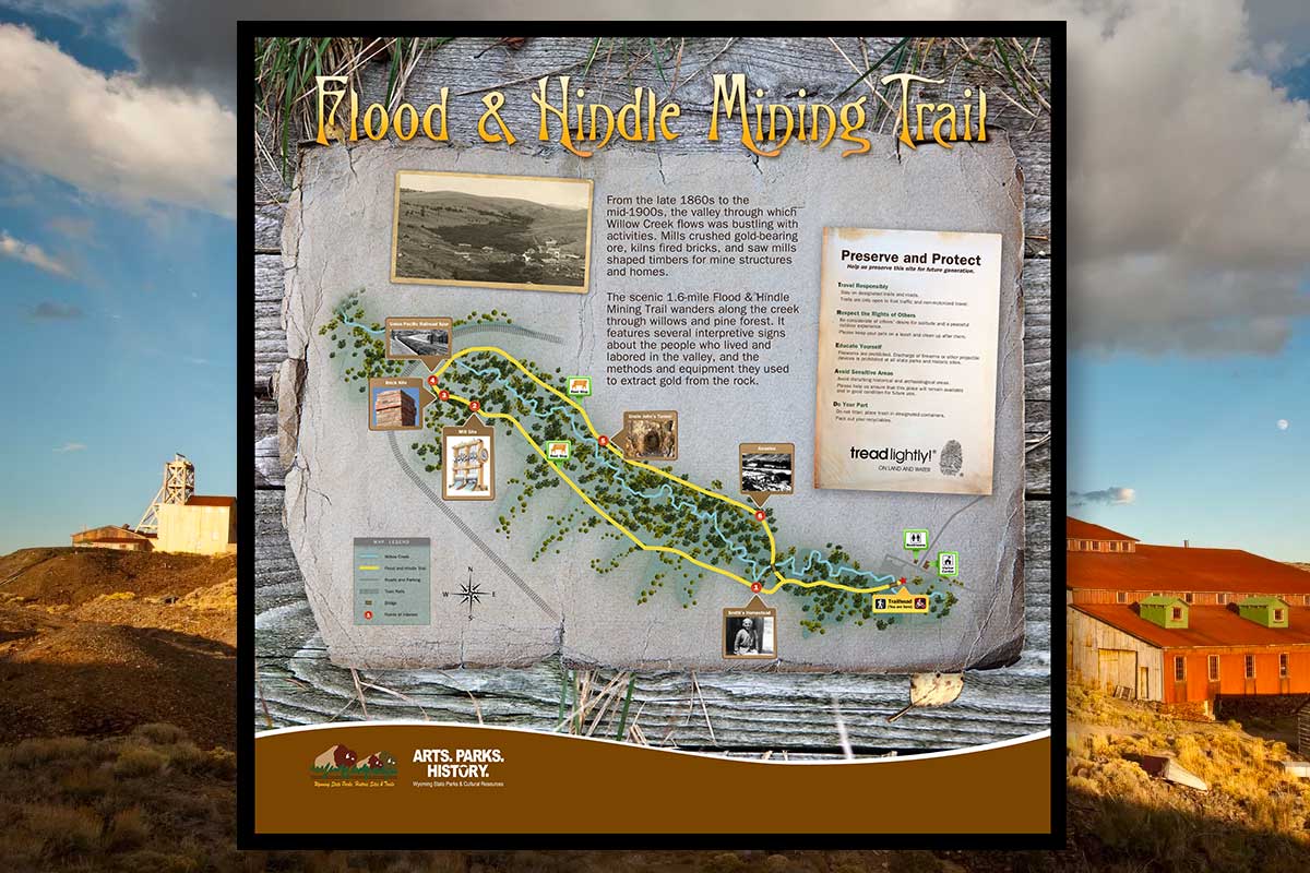
A system of way-finder informative signs along the walking trail of the old South Pass City mining camp. The signs are an outdoor system intended to inform and direct visitors through the historic walking tour.
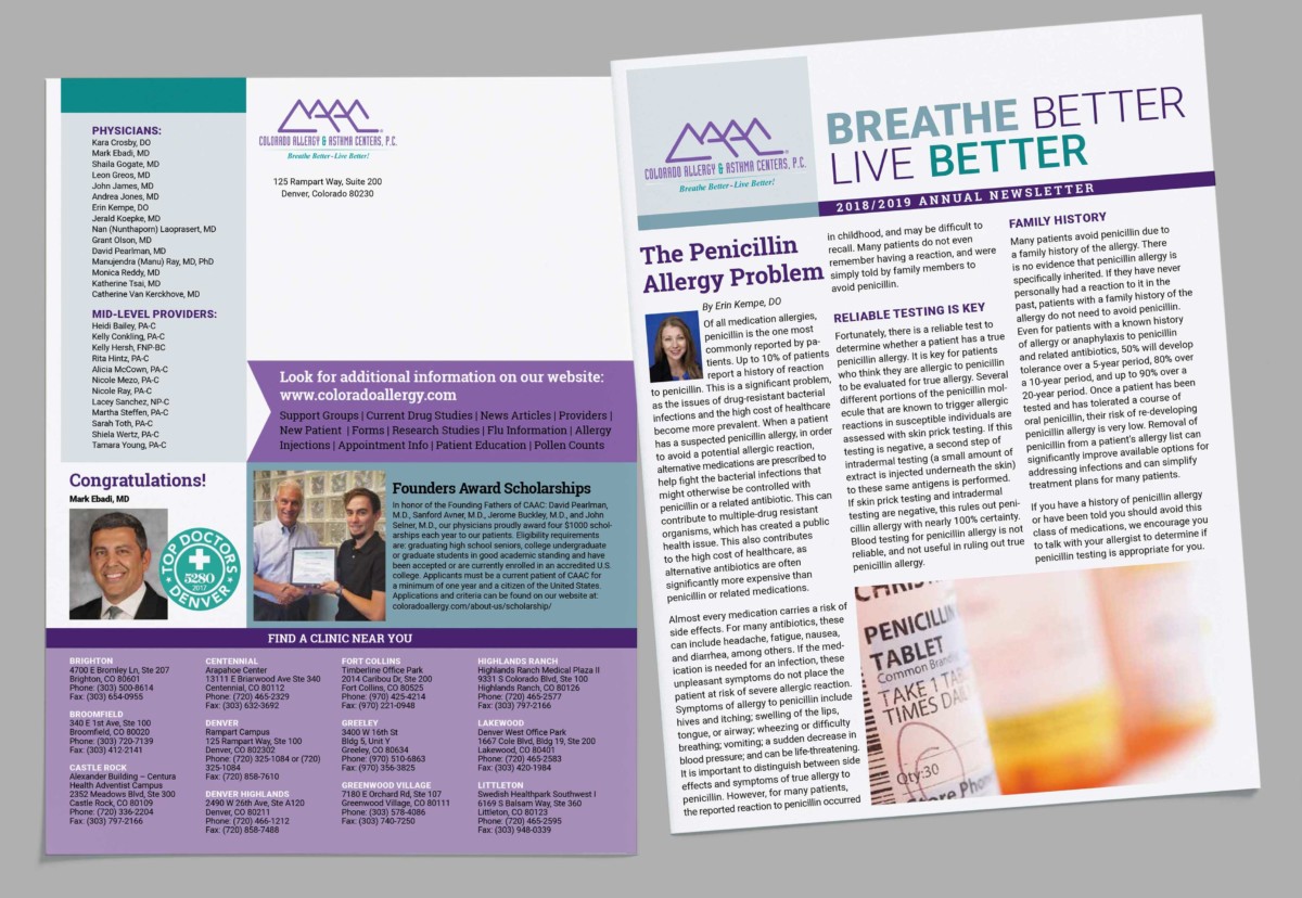
Colorado Allergy & Asthma Centers hired me to redesign annual newsletter for the clinics and patients.
CCRM’s Egg Donor info graphic using a hand-drawn style to reach out to college students on campus.
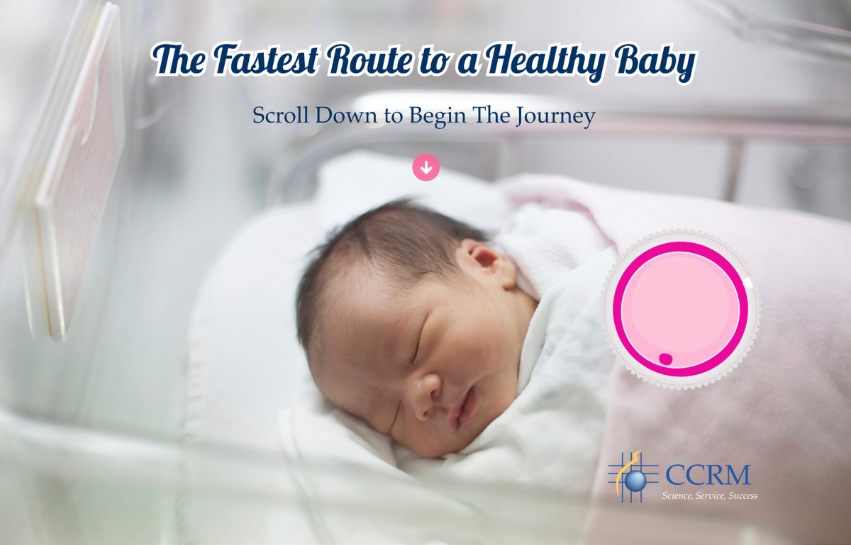
CCRM requested a patient education website that would attract new patients and answer some basic questions on the process of in vitro fertilization. I designed a “journey” style animated adventure then sourced a parallax web developer to do the programming.
These are examples of banner ad campaigns to spark interest for events, programs or just general awareness and include animated gifs.
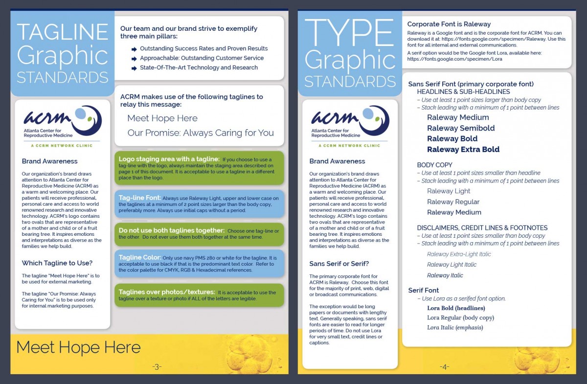
Atlanta Center for Reproductive Medicine hired me to revise their logo slightly and help them create a standard look and feel. They did not want to lose recognition for the mark they had been using for many years, but they also needed to update the colors and shape of the mark.
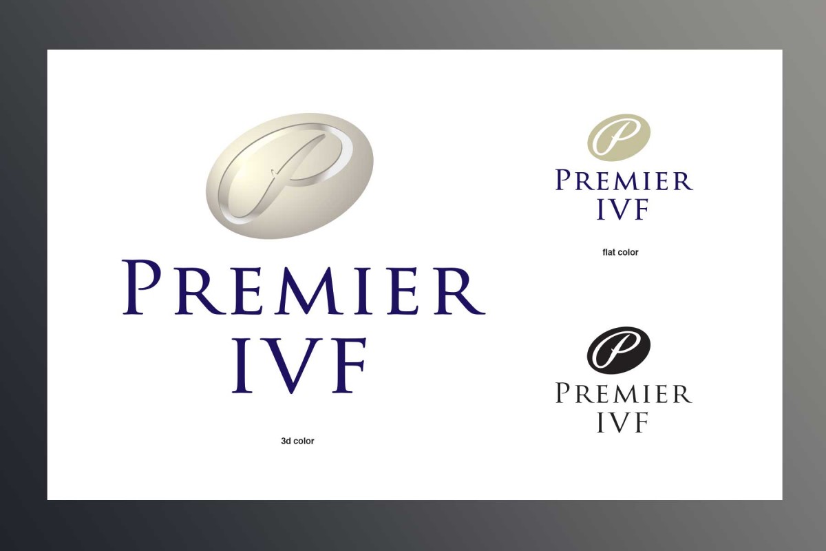
CCRM IVF conceptualized a partnership and patient program called Premier. They hired me to design the logo, a stationary package with business cards and a website. The program was premature and never launched as it was designed, but I've always felt the logo design was a success.
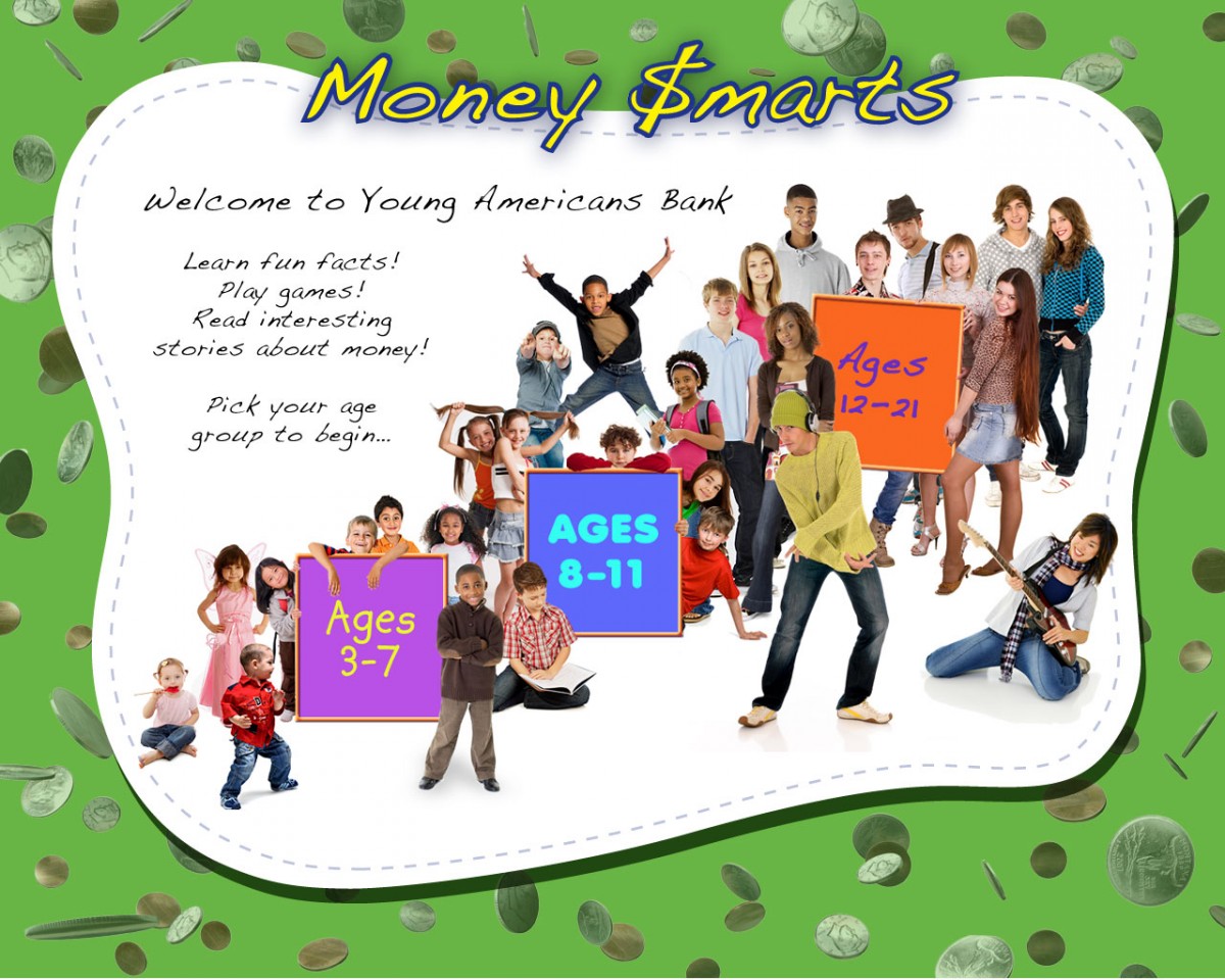
The Young Americans Bank clientele is under 21, so they needed a diversion for siblings and children waiting in line in the bank lobby. They hired Click Point to build a touch screen game kiosk. I designed the interface and worked on the team to brainstorm concepts.
