
Project Description
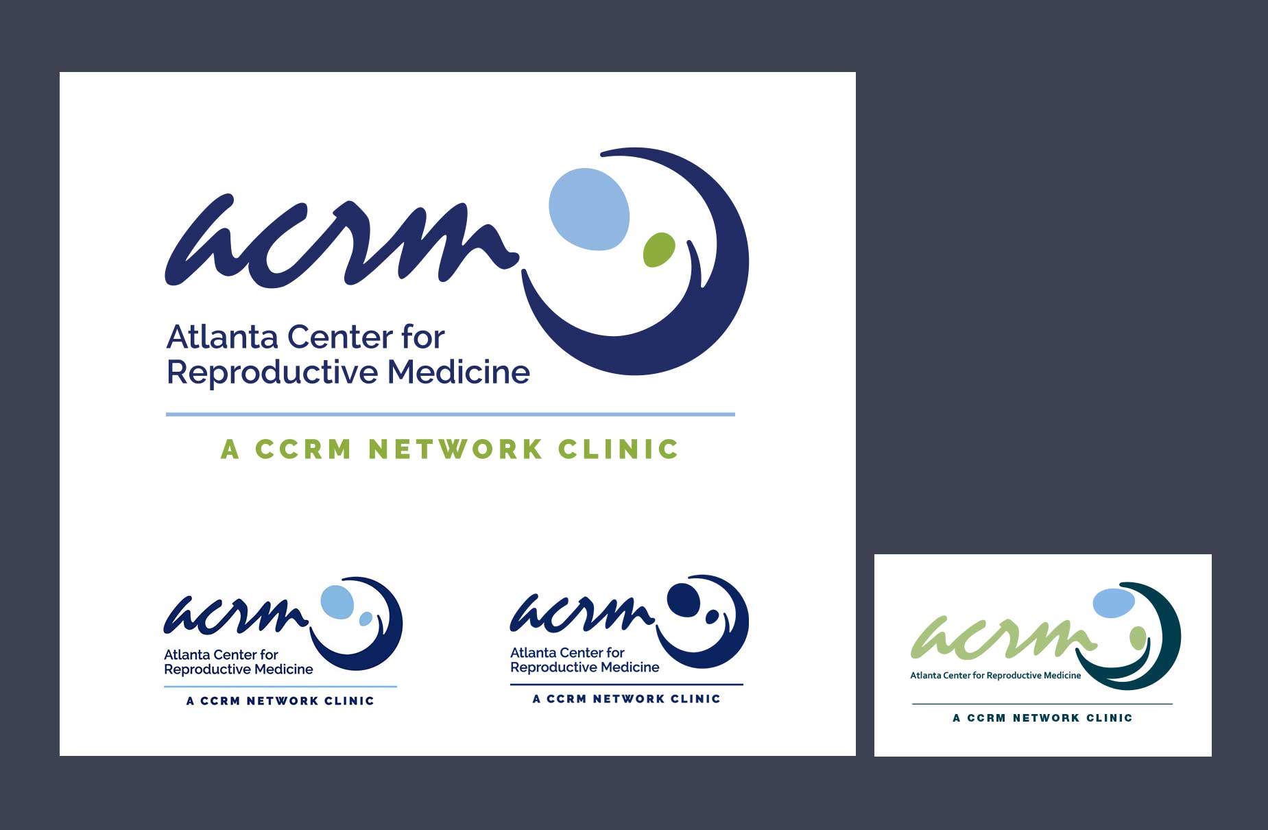
Atlanta Center for Reproductive Medicine hired me to revise their logo slightly and help them create a standard look and feel. They did not want to lose recognition for the ambiguous abstract mark they had been using for many years. Unfortunately, they were attached to the dated script font used in the acronym and the green hue, and felt uneasy changing those elements, but agreed to change the mark and create a color palette.
I updated the shapes in the mark to look like a parent and child, a fetus or a cluster of cells and increased the size of the full company name. I also increased the intensity and percent of the navy blue and green to better work with typography.
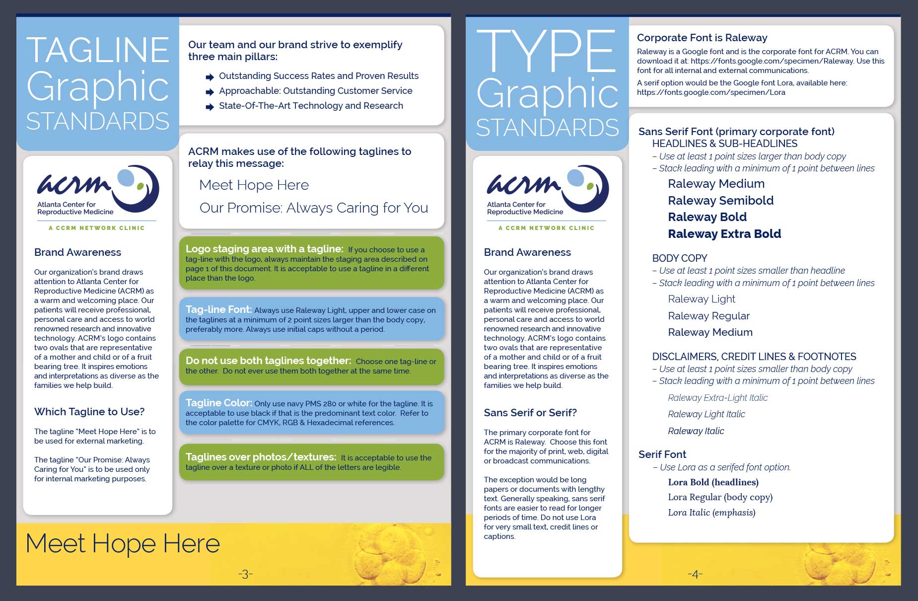
On the standards, I introduced warm colors (yellow, warm grey) to the palette to lend a more colorful look to the materials and created color standards to share with all of their vendors. I chose a more modern font for their materials and established a design that includes softer, rounded corners with large titles in light fonts reversed out of the powder blue. To save cost, I developed a pdf to be shared online or printed in the office with minimal waste of space or paper.